

The Science of Colors That Love You Back
Why Some Colors Pull The Glow Right Out of Faces

Hello friend,
Welcome to PART 3 OF 5 of the Drab Rehab series. I absolutely adore you and want the very best of health, happiness, and freedom for you. This is why I’m encouraging you to see how amazing color can be for your healthy glow.
On an exciting note, I recently left my full-time job at the local college to pursue this work full-time. I thought the letters behind my name meant I needed to make something of my career, but I truly missed working for myself. Hubby and I are still raising 3 of 4 of our kids and we still take care of my brother who has cerebral palsy. Shifting to this work is helping me stay sane and motivated.
I have the lightlovescolor.com website totally functioning (at the bottom of this email, you can even go click a button to grab my brand new Science Of Colors That Love You Back PDF download. I think you will enjoy that. It does trigger an email sequence where I slowly help new readers learn a bit more about the concepts I teach (many of which I learned from Sandy Dumont, my mentor). Substack is still where I will post articles, but I am growing my new presence, too.
Please bear with me through the growing pains, and if you’re interested in upgrading to a paid subscription, I will absolutely make sure it’s an amazing value, including a monthly live call with all of the community! What do you think of that idea?
I have to be honest with myself and with you: one of the reasons I could never stick with running my own business is just how horrible I am at asking people to pay me. But that is changing. We can be paid to provide useful goods and services. Thank you to those who have always been in my corner. It means a lot.
I have been thinking that in August, it will be 10 years since Sandy left us. Ten years seems like a pretty long time, but it’s also been full of crazy events and seems to have flown. COVID alone was insane, and I’m not kidding when I say, “It ruined my first attempt to preserve The Image Architect work.” Nobody was dressing in professional clothes anymore; heck, some people didn’t even wear pants to work! We all know what Sandy would have thought of the times that followed!
To Your Brightest Future,
Tatyana
Now for the feature article:
Your face is responding to color, whether you care about color analysis or not.

Bring a mirror along for this one!
Seriously.
If you’re reading this somewhere with access to a mirror and daylight… humor me for a moment and just out of curiosity, try a few things.
Because today we leave history. We leave quiet luxury. We leave psychology for a moment.
And we talk about something unheard of for modern fashion culture: science.
Not personality.
Not vibes.
Not Pinterest mood boards.
Science, and more specifically, the physics of light.
A Small Problem Nobody Warned Us About
Most people think color is mostly about taste.
Preference.
Identity.
Mood.
“I’m a neutral person.”
“I’m not really a bright colors person.”
“Muted feels more like me.”
You absolutely get to have preferences.
This is not anti-preference.
But I want to introduce a mildly inconvenient idea.
The colors near your face are already doing something…whether you personally believe in color analysis or not.
That is where Light Loves Color exists, in that uncomfortable gap between what’s popular and what’s real.
Not with seasons.
Not with celebrity examples.
Not with internet quizzes.
Just observation and a plain, child-like curiosity.
Because something observable happens when fabric sits near human skin.
And once you begin noticing it…it becomes pretty hard to unsee.
Those of you who have been with me for quite some time. Even better, those of you who are here from Sandy’s days, you will know this, so humor the new readers as we get these ideas out there for the new generation to think about.
The Simple Window Experiment
Let’s start super simple.
No rules yet.
No labels.
Just a tiny experiment.
Find natural daylight. Stand near a window. Pull your hair back. Now hold two colors under your chin.
Not wildly different colors.
Same family.
Different saturation.
Examples:
sage versus emerald,
dusty blue versus royal blue,
muted berry versus fuchsia,
greyed lavender versus clear violet,
Don’t evaluate whether you like them.
Don’t evaluate personality.
Don’t evaluate trendiness.
Just watch your face.
Then, ask:
Which one makes my complexion look smoother?
Which one brings out my features?
Which one deepens shadows?
Which one makes my face pop?
Which one do I blend right into?
It’s an interesting experiment because for many people, the answers become clear surprisingly fast. It’s just a simple test of bright vs. grayed colors and if you want to know what’s working in the background, you will definitely want to read to the end, where I give you the download to my research, totally free.
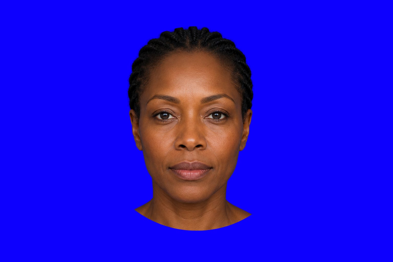
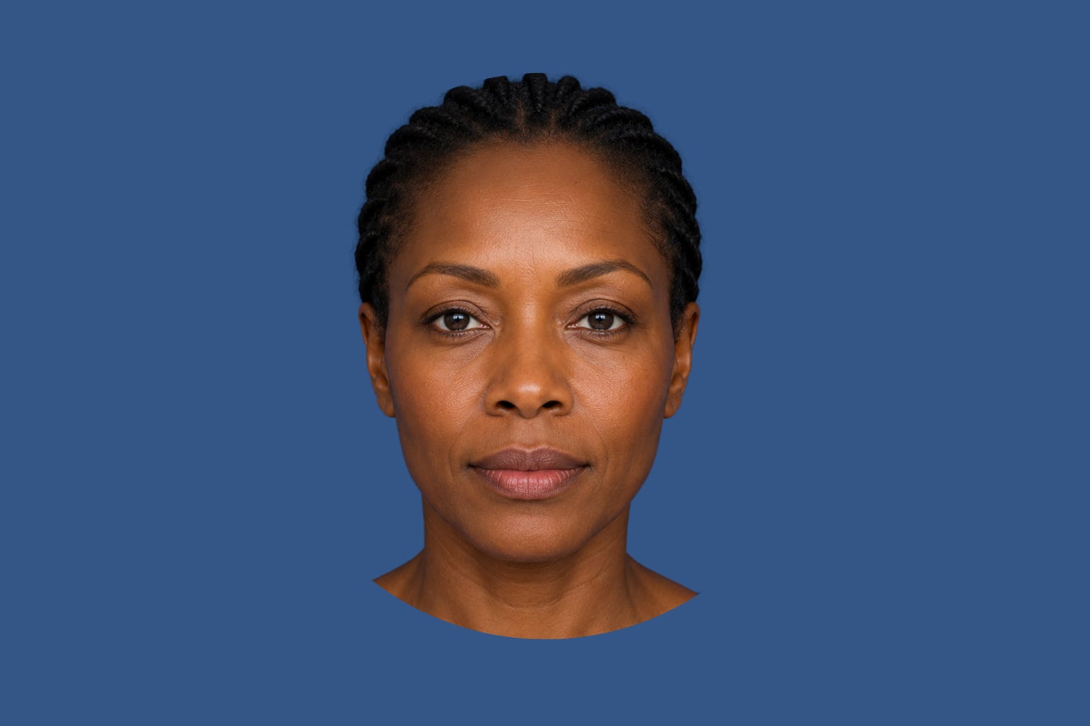
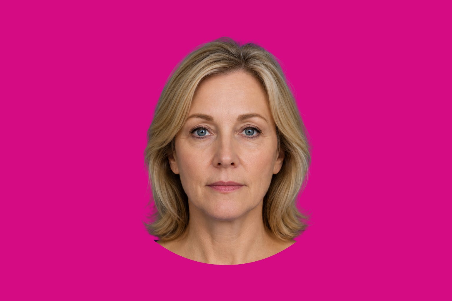
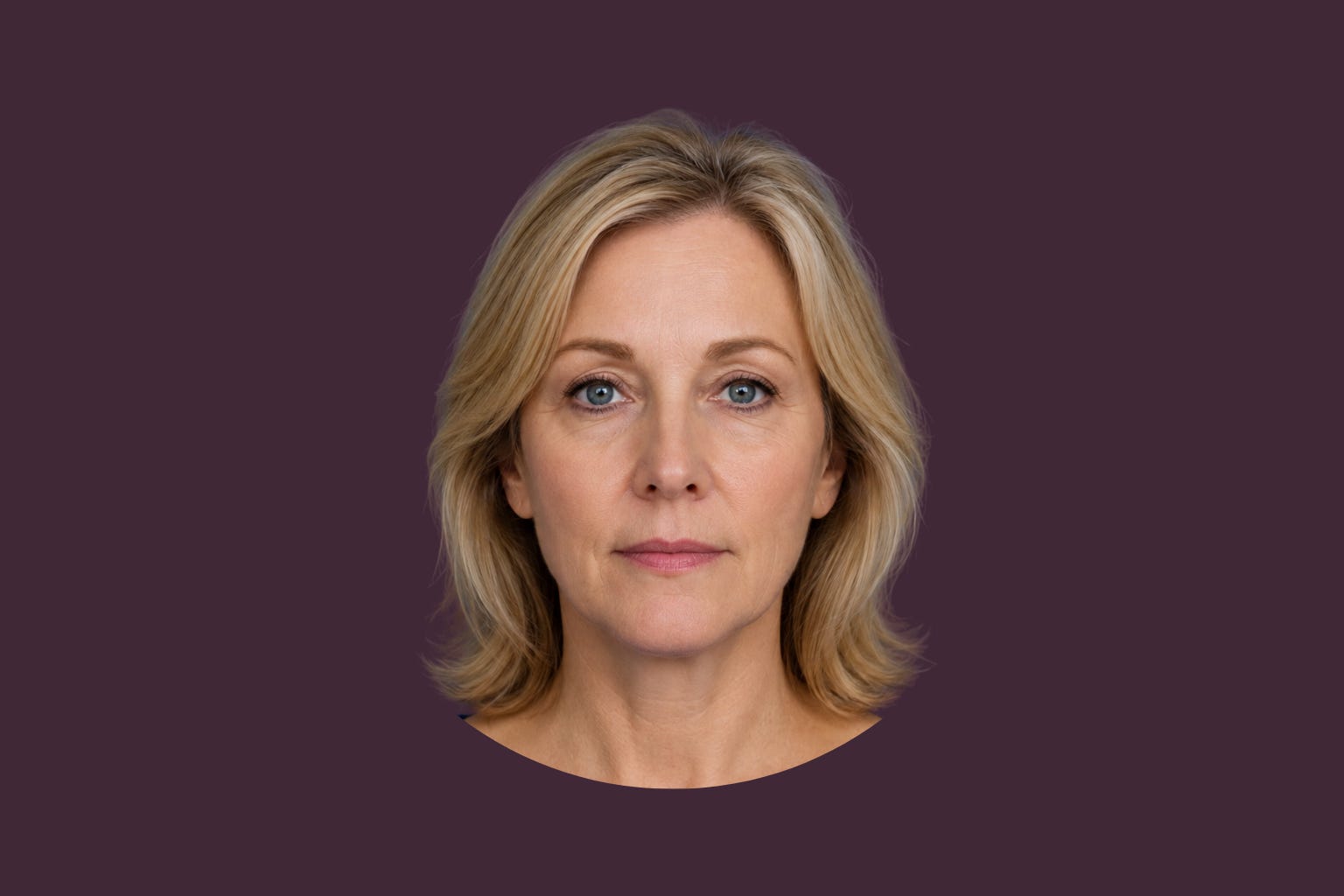
Just as an example, though, take a look at the faces below. The first face is on a bright color and the second one on its dusty counterpart. Do you see the same smoothness, energy, glow, and vitality in both?


The Face Is Not Passive
Here is the concept mainstream wardrobe advice often skips. Your face doesn’t passively coexist beside color. It interacts with it. The human visual system processes color relationally. Colors influence how adjacent surfaces are perceived, including our skin. This principle has a long history in color science and visual perception. Light Loves Color builds heavily on one simple, practical reality: colors near the face can amplify or suppress visual vitality.
Some seem to brighten.
Some flatten.
Some sharpen.
Some dull.
Some create clearer definitions.
Some seem to drain it.
Why So Many People End Up In Drab Colors Anyway
Because muted colors often feel emotionally reasonable, safe, unnoticeable. Sometimes we put a different label on them: professional, tasteful, safe, sophisticated, predictable, low risk. I could keep going. We humans put a spin on everything we do, don’t we?
These muted colors rarely start bold conversations, rarely attract comments, rarely make us worry we are “too much.”
The appeal is irresistible in our complicated world.
I get it!
But there is an uncomfortable possibility worth exploring. Sometimes, muted palettes solve a social problem while unintentionally creating a visual one. A visual problem for our face.
Be honest. Do you actually hate colors? Very few people would say they don’t like colors. They love the sunsets and oceans, fresh roses in gorgeous vases, they love the trees and flower gardens. You see a kaleidoscope of color out there in nature and you’re in awe. Am I wrong?
We love color. BUT! We often don’t love it on us. There are a lot of whys to this. A lot! But many of them are nothing but the idea of “normal” we grew up with. Most of us don’t venture far from the idea of normal we grew up with in anything in our lives. We play it safe. Creatures of habit we are.
You might even like color enough to have owned a bright-colored garment you absolutely loved on the rack and vowed to wear it someday. Years passed by and all it did was look beautiful hanging in the closet. “Maybe I’ll wear that on a special occasion one day”, you’d think, but somehow, always reach for the pieces that help you disappear a bit. Nothing too bold, too noticeable.
I understand the psychology, but those grayed-down colors do a lot to our faces. And the older you get, the more noticeable.
Beige can make our face blend right into our shirt.
Dusty mauves and pinks have been so popular lately because people think that’s their version of wearing color, but those grayed-down tones have a lot of gray in them.
Muted sage, soft gray, dusty blue, they all affect how others see our faces.
Not universally.
But often enough that the pattern deserves attention.
The Saturation Question
Let’s talk saturation.
Not complicated.
Just useful.
Saturation refers to how clear, vivid, intense, or greyed-down a color appears.
Think:
royal blue.
Versus dusty blue.
True red.
Versus muted brick.
Emerald.
Versus sage.
One carries more visual intensity.
One carries more grey influence.
Light Loves Color takes a position here that differs from much of the mainstream internet color culture.
Observation across Sandy Dumont’s methodology suggests something interesting.
Most people respond surprisingly well to clearer, brighter colors than they have been taught to expect.
Not obnoxious neon.
Not gaudy costume colors.
Not maximalism.
Just simple bright colors that complement our undertones.
This is one area where I intentionally diverge from recommendations emphasizing muted neutrality based on personality traits and low-contrast features.
Actual observation of what a color does to a face deserves priority.
Look at the face.
Test the colors.
Let reality lead.
The Undertone Question
Here is where internet color analysis usually becomes a twelve-season maze.
Warm.
Cool.
Neutral warm.
Neutral cool.
Soft bright warm-neutral-cool-adjacent-but-olive.
You know the spaghetti bowl of options.
I take a simpler position.
All of my ideas are built on the history of art, the science of visual perception, my mentor and image consultant, Sandy Dumont’s decades of work across more than 25 nationalities, and my own 19 years living these principles.
My framework argues that cool undertones are substantially more common than mainstream systems often acknowledge. In the 16,000+ sessions that Sandy held throughout her career, she estimated that 80-90% of all the color sessions found the client to have cool undertones.
Warm and olive undertones absolutely exist and they matter.
For this article, the takeaway is this is much simpler than the internet often suggests.
Many women living in dusty, muted wardrobes are closer to a dramatic face filter available with a quick change of their shirt.
The Neckline Rule
This may be one of the most useful concepts in all of Light Loves Color:
Color near the face operates differently from color elsewhere.
This is huge.
Because it gives complete color freedom.
You don’t need to rebuild your entire wardrobe around a palette chart.
Your shoes aren’t interacting with your cheekbones.
Your handbag is not sitting beneath your jawline.
Your neckline is a different story.
The colors closest to your face deserve more intentional observation than the colors near your ankles.
This distinction alone removes enormous unnecessary rigidity from color analysis.
The face is physics.
Everything else is more flexible.
Now, I invite you to check out the beginning of the new website I’ve built HERE, and while there, be sure to put your email in to download my new research on The Colors That Love You Back.
Below is Drab Rehab Labs for paid subscribers, where we test saturation, undertone, visibility, and professional application through real experiments, real mirrors, and real wardrobes.
Your brightest future awaits!
